
commande KEYFRAMES
Rôle
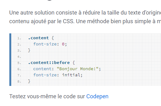
La commande @keyframes permet de spécifier les étapes d’une animation.
Vous pouvez découper l’animation en deux étapes : from to.
@keyframes mvt {
    from {transform: rotate(-45deg)}
    to {transform: rotate(45deg)}
}
ou en plusieurs étapes : entre 0 et 100%.
@keyframes mvt {
    0% {transform: rotate(-45deg)}
    50% {transform: rotate(0deg)}
    100% {transform: rotate(45deg)}
}
Vous pouvez modifier plusieurs attributs pour chaque étape :
@keyframes mvt {
    0% {transform: rotate(-45deg); color: red;}
    50% {transform: rotate(0deg); color: orange;}
    100% {transform: rotate(45deg); color: green;}
}
Testez vous-même cet attribut
Utilisez Codepen.
– Le code CSS
body{
  padding: 30px;
  background-color: rgb(230,230,230);
}
img{
  border-radius: 50%;
  width: 200px;
  position: relative;
  display: block;
  margin: 0 auto;
  border: thin solid orange;
  animation: cos 3s infinite linear alternate ;
}
@keyframes cos {
  0% {transform: rotate(-45deg); left: -50px}
  100% {transform: rotate(45deg); left: 50px}
}
– Le code HTML
<img src="//lorempixel.com/output/people-q-c-200-200-6.jpg" alt="">
Résultat
Dans cet exemple l’animation concerne un mouvement de rotation (de -45° à 45°) et un réajustement de position (-50px à 50px) qui dure 3 secondes. Cette animation sera alternée infiniment.
Compatibilité


L’attribut animation est pris en charge par tous les principaux navigateurs
A partir d’Internet Explorer 10.
Pour implémenter cet attribut sur un ensemble de navigateur, vous devez utilisez les préfixes -webkit-(Chrome, Safari, Android…), -moz- (Mozilla), -o- (Opéra).
